Principal Components Analysis (PCA) is a common way to do dimension reduction in machine learning (ML). Let’s say you have 1,000,000 features, you could use PCA to reduce that down to a manageable number, possibly 10 features. How does the PCA do this dimension reduction? Let’s dive in.
The PCA looks for differences in variance. Essentially, features with high correlations with each other are wrapped into one component. This isn’t actually what the algorithm is doing, just an easy way to conceptualize what is accomplished. Each principal component contributes a certain amount of variance of the data. The first components explain the most amount of variance.
A PCA will find a line where the most variance between the line and the feature points. To do this, eigenvectors and eigenvalues are created from a covariance matrix. An eigenvector is a linearly transformed vector and the the eigenvalue associated with it is the amount of variance held within that vector. The bigger the eigenvalue of an eigenvector, the more variance explained.
This process can be broken down like this:
So we have a good overview of what the PCA is accomplishing and how it’s being done. Let’s visualize it.
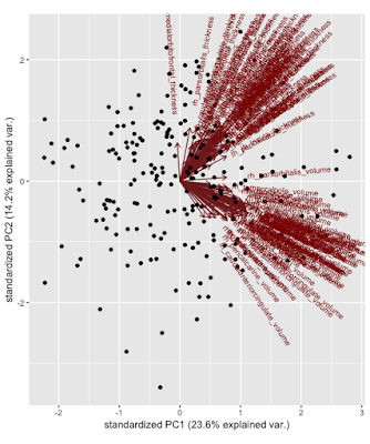
Once all of the PCs have been found, you are able to plot the loadings (eigenvectors) and their relation into a graph that we’ll call a biplot. What does this mystical picture mean? Basically we’ve transformed the original data into terms of PC1 and PC2 by multiplying the eigenvectors (1 & 2) by the preprocessed original data. You can of course do this for how many ever dimensions you want, they just become rather hard to visualize. We can see that thickness or volume features aren’t captured more by PC1 v. PC2 because of their diagonal directions but similar features are clustering together, volume with volume and thickness with thickness. Being towards the positive or negative direction does not matter for PCA, it’s arbitrary. All of the dots on the graph are the individual observations (figure 1).
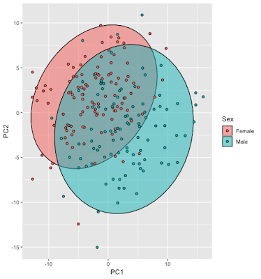
In figure 2 is an overlay where you can see each point’s group and its relation to the PCs:
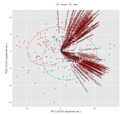
In figure 3 two plots combined and what you’ll see in my GitHub code. This is probably the most useful plot for visualizing the PCs in relation to the observations.
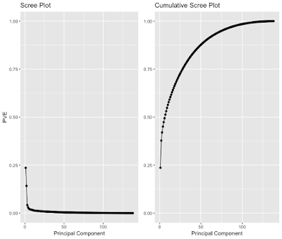
You might be wondering how to determine how many PCs to keep. There is no consensus on how to do it and your method of determining how many to keep will change on what you want to accomplish. A popular plot to use is called the scree plot (figure 4) and using the elbow criterion to determine the number of PCs. This plots the percent variance explained v. number of PCs. It is quite arbitrary, especially in this case where it’s hard to determine where the elbow is. Is it 3, 4, 5, etc. PCs? This probably suggests that it would be better to try another new method.
All of this plotting is great, but what is there to do with these PCs? In a future blog post, I will discuss how these can be used for a confirming a machine learning model’s generalization. These PCs, can also be the input features for a machine learning model in lieu of morphometry, which these are derived from.
The tutorial for doing a PCA analysis is on my YouTube channel and the code can be found on my Github.